 Sunil Sharma
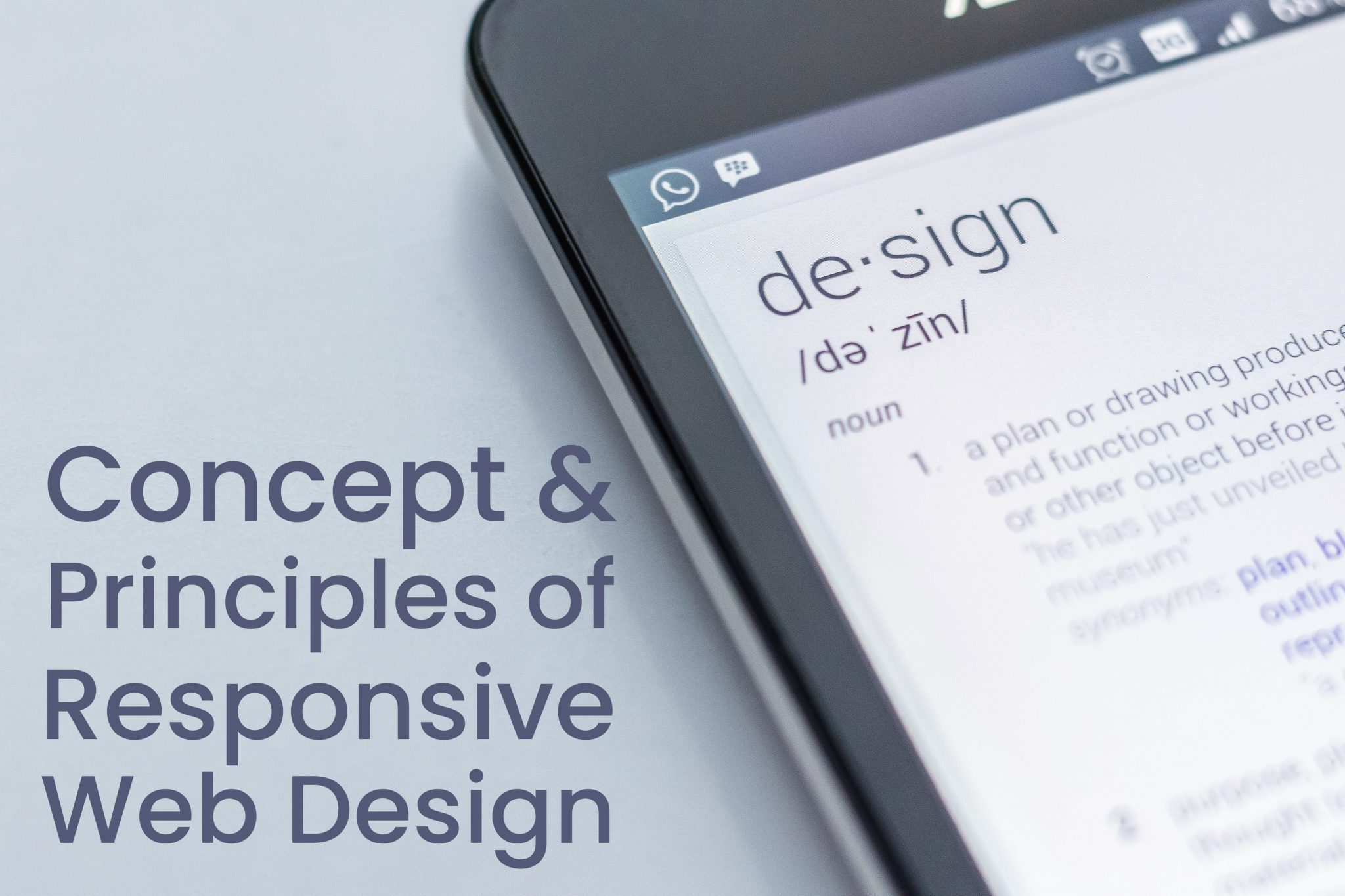
Concept and Principles of Responsive Web Design
Responsive web design is the strategy that ensures development and design respond to the user’s behavior and environment based on screen size, platform, and orientation.
As users switch from laptops to tablets, the website should adapt to resolution, image dimensions, and scripting abilities automatically.
The Concept of Responsive Web Design
Responsive web design becomes clearer when you analyze and understand modern web and mobile technology. Implementing responsive design is simpler than you might think.
The exponential increase in devices has led to diverse browser specifications and display resolutions. Consequently, there’s a need for scalable, adaptable designs that accommodate screens of all sizes.
A wide variety of information about responsive web design is available online. However, much of it is abstract and anecdotal. The core methods to achieve responsive design include:
Fluid Images
Fluid images face challenges like maintaining aspect ratios. As viewports grow larger, images grow in size too, requiring proportional scaling.
To design websites compatible with countless display sizes, avoid fixed dimensions. Instead, make layouts adaptive and scalable for screens of all sizes.
Key Points for Responsive Design
- Set the maximum width of images to 100% of the screen or browser width.
- Resize images and reduce their resolution on smaller devices to save space and loading time.
Media Queries
Media queries are crucial for creating responsive websites. They enable developers to create fluid layouts that adapt to devices without distortion.
It’s essential to store media query rules in a separate CSS file for better organization and easier modifications.
Principles of Responsive Web Design
Responsive design is an excellent solution to the multi-screen challenge. Instead of designing for fixed sizes, adopt fluid web design principles to embrace a variety of devices.
Proper Use of Breakpoints
Breakpoints allow layouts to adjust at predefined points, such as switching from three columns on desktops to one on mobile devices. Use breakpoints wisely to maintain clarity.
Fluid Grids
Fluid grids use relative proportions instead of fixed widths to design layouts. This approach accommodates screens ranging from phones to large HDTVs.
Mobile or Desktop First
Decide whether to start designing for smaller or larger screens first. Both approaches work well, but starting from mobile can help address limitations early on.
Accessibility
Ensure all content is easily accessible. Text should be readable on all screen sizes. Choose colors that are appealing but not harsh, and maintain visual balance in your design.
Nested Objects
Use containers to organize elements clearly and keep designs tidy. Fixed units like pixels are useful for unscalable elements like logos or buttons.
Bitmap Images vs. Vectors
Bitmap images are suitable for detailed icons with effects, while vector images work well for simpler designs. Optimize all images to ensure fast loading and compatibility.
Free Online Courses with Internship Certificate
Free Online Courses with Internship Certificate
Share Post
Related reading
 What to Look for in Ecommerce Solution Company?
What to Look for in Ecommerce Solution Company? In this...
 Combining python and create dynamic app
Combining Python and D3.js to Create Dynamic Visualization Applications Combining...
 Top 10 Web Design Tools: Free, Responsive, New and Best- I
Top 10 Web Design Tools: Free, Responsive, New and Best-...
 Top 5 Essential Tools for Front-End Web Development Service
Top 5 Essential Tools for Front-End Web Development Service Web...